Improve your skills

May 23, 2017

Difference Between Response.Write() and Response.Output.Write()

Response.Write() and Response.Output.Write() both are used for print output on the screen.
But their are some differences between both of them-

Response.Write()
  1. Output is written in text stream.
  2. Response.Write() is used to display only string (Normal Text). It can't allows the formatted output.
  3. As Per Asp.Net 3.5, Response.Write() Has 4 overloads.
  4. We can't display any other data type values like int, date etc. Conversion(from one data type to another) is not allowed.
  5. Example:
    Response.Write("Hello ASP.NET");
    Response.Write("Current Date Time is " + DateTime.Now.ToString());

Response.Output.Write()

  1. Output is written in HTTP Output Stream.
  2. Response.Output.Write() is allows us to print formatted output. formatted output needs to argument based on which the output will be formatted.
  3. As Per Asp.Net 3.5, Response.Output.Write() has 17 overloads.
  4. We can display any type of data like int, date, string etc. by giving index values.
  5. Example: 
    Response.Output.Write("{0} is {1:d}", "Current Date Time is: ", DateTime.Now);


May 16, 2017

Mail Sent by Narayan Murthy to All Infosys Staff


1. If you are working more than 9 hr then don't need to join Infosys.
2. If you are working on Saturday and Sunday don't join Infosys (for IT).
3. Whatever time define in your task complete within time.

Fire all people who fall in criteria 1,2,3.

It’s half past 8 in the office but the lights are still on… PCs still running, coffee machines still buzzing… And who’s at work? Most of them ??? Take a closer look…

All or most specimens are ?? Something male species of the human race…
Look closer… again all or most of them are bachelors…
And why are they sitting late? Working hard? 
No way!!! 
Any guesses??? 
Let’s ask one of them… 
Here’s what he says… ‘What’s there 2 do after going home…Here we get to surf, AC, phone, food, coffee that is why I am working late…Importantly no bossssssss !!!!!!!!!!!’

This is the scene in most research centers and software companies and other off-shore offices.
Bachelors ‘Passing-Time’ during late hours in the office just because they say they’ve nothing else to do… Now what r the consequences…

‘Working’ (for the record only) late hours soon becomes part of the institute or company culture.
With bosses more than eager to provide support to those ‘working’ late in the form of taxi vouchers, food vouchers and of course good feedback, (oh, he’s a hard worker….. goes home only to change..!!). They aren’t helping things too…

To hell with bosses who don’t understand the difference between ‘sitting’ late and ‘working’ late!!!
Very soon, the boss start expecting all employees to put in extra working hours.

So, My dear Bachelors let me tell you, life changes when u get married and start having a family… office is no longer a priority, family is… and That’s when the problem starts… because you start having commitments at home too.

For your boss, the earlier ‘hardworking’ guy suddenly seems to become a ‘early leaver’ even if u leave an hour after regular time… after doing the same amount of work.

People leaving on time after doing their tasks for the day are labelled as work-shirkers…
Girls who thankfully always (its changing nowadays… though) leave on time are labelled as ‘not up to it’. All the while, the bachelors pat their own backs and carry on ‘working’ not realizing that they r spoiling the work culture at their own place and never realize that they would have to regret at one point of time.

So what’s the moral of the story??
* Very clear, LEAVE ON TIME!!!
* Never put in extra time ‘ unless really needed ‘
* Don’t stay back unnecessarily and spoil your company work culture which will in turn cause inconvenience to you and your colleagues.

There are hundred other things to do in the evening..
Learn music…..
Learn a foreign language…
Try a sport… Table Tennis, Cricket………..
Importantly, get a girl friend or boy friend, take him/her around town…
* And for heaven’s sake, net cafe rates have dropped to an all-time low (plus, no fire-walls) and try cooking for a change.

Take a tip from the Smirnoff ad: *’Life’s calling, where are you??’*
Please pass on this message to all those colleagues and please do it before leaving time, don’t stay back till midnight to forward this!!!

IT’S A TYPICAL INDIAN MENTALITY THAT WORKING FOR LONG HOURS MEANS VERY HARD WORKING & 100% COMMITMENT ETC.

PEOPLE WHO REGULARLY SIT LATE IN THE OFFICE DON’T KNOW TO MANAGE THEIR TIME. SIMPLE !

Regards,
NARAYAN MURTHY.


March 25, 2017

How to Invite All Friends to Like a Facebook Page In One Click

Hello friends, today i will tell you how we invite our all friends to like a page on Facebook with some simple steps(with pictures).

Step - 1.
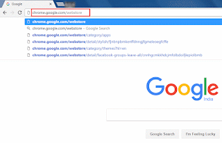
First of all, Open google chrome browser in your computer and type "chrome.google.com/webstore" (without quotes) in address bar and press enter.
How to Invite All Friends to Like a Facebook Page In One Click - web code logics
Step - 2.
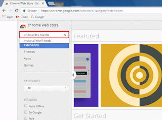
Type "invite all the friends" (without quotes) in webstore search option and press enter.
How to Invite All Friends to Like a Facebook Page In One Click - web code logics
 
Step - 3.
Then, you see some extension. Click on "Invite All Friends on Facebook" extension which have good rating show as below picture-
How to Invite All Friends to Like a Facebook Page In One Click - web code logics
 
Step - 4.
Click on "Add to Chrome" button.
How to Invite All Friends to Like a Facebook Page In One Click - web code logics
 
Step - 5.
Click on "Add extension" button to add in your chrome browser.
How to Invite All Friends to Like a Facebook Page In One Click - web code logics
 
Step - 6.
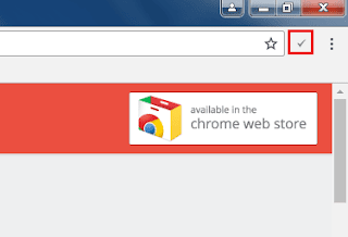
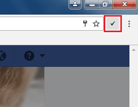
Now it successfully added in your browser. You can see this in your top right corner of your chrome browser shown as below picture-
How to Invite All Friends to Like a Facebook Page In One Click - web code logics
 
Step - 7.
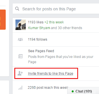
Login your Facebook account and open your Facebook page in which you want to invite your friends. Then, click on "Invite friends to like this Page" in right panel of your Facebook page.
How to Invite All Friends to Like a Facebook Page In One Click - web code logics
 
Step - 8.
Now you see a  popup have all your friends list as shown in below picture -
How to Invite All Friends to Like a Facebook Page In One Click - web code logics
 
Step - 9.
Then click on "Invite all Friends on Facebook" extension icon which shown in your browser's top right corner.
How to Invite All Friends to Like a Facebook Page In One Click - web code logics
 
Step - 10.
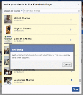
Then wait... It will take some time to invite your all friends to like this page. (process time depends on how long your friends list).
How to Invite All Friends to Like a Facebook Page In One Click - web code logics
 
Step - 11.
When it  completed, close your both popups .
How to Invite All Friends to Like a Facebook Page In One Click - web code logics

Great, you have done it.


January 18, 2017

How to Blink or Flashing Text or Image Using Simple CSS3 with Example


Introduction:
In this article, we will learn about How to blink or flashing any text or image using simple CSS3 animation effect with example. or How to use animation effect in CSS3 to blink or flashing any text or image. 

The preview are shown as below-

How to Blink or Flashing Text or Image Using Simple CSS3 with Example


To blink/flash text or image write the code as shown below-

HTML:
<!DOCTYPE html>
<html xmlns="http://www.w3.org/1999/xhtml">
<head>
    <title>How to Blink or Flashing Text or Image Using Simple CSS3 with Example | webcodelogics.com</title>
    <style>
        .blink {
            -webkit-animation-name: blinker;
            -webkit-animation-duration: 1s;
            -webkit-animation-timing-function: linear;
            -webkit-animation-iteration-count: infinite;
            -moz-animation-name: blinker;
            -moz-animation-duration: 1s;
            -moz-animation-timing-function: linear;
            -moz-animation-iteration-count: infinite;
            animation-name: blinker;
            animation-duration: 1s;
            animation-timing-function: linear;
            animation-iteration-count: infinite;
        }

        @-moz-keyframes blinker {
            0% { opacity: 1.0; } 
            50% { opacity: 0.0; } 
            100% { opacity: 1.0; }
        }

        @-webkit-keyframes blinker {
            0% { opacity: 1.0; }
            50% { opacity: 0.0; }
            100% { opacity: 1.0; }
        }

        @keyframes blinker {
            0% { opacity: 1.0; } 
            50% { opacity: 0.0; } 
            100% { opacity: 1.0; }
        }
        
        .block { text-align: center; width: 100%; }
        .block span{ font-size:25px; font-family:Arial; }
        .block img{ vertical-align: middle; margin-right:25px; }
    </style>
</head>
<body style="background: #E0EDFA;">
    <div class="block">
        <img src="http://webcodelogics.com/Images/logo.png" class="blink" alt="webcodelogics.com" />
        <br />
        <span class="blink">webcodelogics.com</span>
    </div>
</body>
</html>


Now save the code and run on browser to view the blink/flash text animation effect.

Demo:

How to Blink or Flashing Text or Image Using Simple CSS3 with Example webcodelogics.com


January 10, 2017

Create Animated Pie Chart Using CSS3 and Simple jQuery with Example


In this article, we will learn about how to create animated pie chart using css3 and simple jQuery with example and live demo.

The preview are shown as below-

create-animated-pie-chart-using-css3-and-simple-jquery-with-example | webcodelogics.com


To create animated pie chart write the code as shown below-

HTML:
<!DOCTYPE html>
<html xmlns="http://www.w3.org/1999/xhtml">
<head>
    <title>Create Animated Pie Chart Using CSS3 and Simple jQuery with Example | webcodelogics.com</title>
    <!-- jQuery Library Link -->
    <script src="https://code.jquery.com/jquery-3.1.0.min.js" type="text/javascript"></script>
    <style>
        .circular_chart_main {
            width: 330px;
            margin: 100px auto;
            border: 1px solid #ddd;
            font-family: Arial;
            padding: 15px;
        }

        .circular_chart_main h4.head {
            border-left: medium none;
            font-size: 12px;
            font-weight: bold;
            margin-bottom: 7px;
        }

        .circular_chart_main h4.head span {
            float: right;
        }

        @keyframes bake-graph {
            from {
                transform: rotate(0deg) translate3d(0,0,0);
            }
        }

        .chart {
            display: inline-block;
            vertical-align: middle;
        }

        .graph {
            height: 150px;
            width: 150px;
            margin-right: 15px;
            position: relative;
        }

        .graph::before {
            content: "";
            display: block;
            position: absolute;
            z-index: 1;
            width: 70px;
            height: 70px;
            background: #EEE;
            border-radius: 50%;
            top: 40px;
            left: 40px;
        }

        .slice {
            position: absolute;
            width: 150px;
            height: 150px;
            clip: rect(0px, 150px, 150px, 75px);
            animation: bake-graph 1s;
            color: #333;
        }

        .slice span {
            display: block;
            position: absolute;
            top: 0;
            left: 0;
            background-color: black;
            width: 150px;
            height: 150px;
            border-radius: 50%;
            clip: rect(0px, 150px, 150px, 75px);
        }

        .legend {
            list-style-type: none;
            padding: 0;
            margin: 0;
            font-size: 13px;
            width: 155px;
        }

        .legend li {
            line-height: 12px;
            height: 12px;
            margin-bottom: 9px;
            padding-left: 7px;
            border-left: 12px solid #ddd;
        }

        .legend em {
            font-style: normal;
        }

        .legend span {
            float: right;
        }
    </style>
    <script>
        $(document).ready(function () {
            createGraph(".circular_chart_main .chart .legend", ".circular_chart_main .chart.graph");
        });

        function createGraph(dataElement, graphElement) {
            var listData = [];
            $(dataElement + " span").each(function () {
                listData.push(Number($(this).html()));
            });
            var listTotal = 0;
            for (var i = 0; i < listData.length; i++) {
                listTotal += listData[i];
            }
            var offset = 0;
            var color = ["#FF6347", "#6495ED", "#FFA500", "#6B8E23", "#CA6FF8"];
            for (var i = 0; i < listData.length; i++) {
                var size = sliceSize(listData[i], listTotal);
                iterateSlices(size, graphElement, offset, i, 0, color[i]);
                $(dataElement + " li:nth-child(" + (i + 1) + ")").css("border-color", color[i]);
                offset += size;
            }
        }

        function sliceSize(dataNum, dataTotal) {
            return (dataNum / dataTotal) * 360;
        }

        function addSlice(sliceSize, graphElement, offset, sliceID, color) {
            $(graphElement).append("<div class='slice " + sliceID + "'><span></span></div>");
            var offset = offset - 1;
            var sizeRotation = -179 + sliceSize;
            $(graphElement + " ." + sliceID).css({
                "transform": "rotate(" + offset + "deg) translate3d(0,0,0)"
            });
            $(graphElement + " ." + sliceID + " span").css({
                "transform": "rotate(" + sizeRotation + "deg) translate3d(0,0,0)",
                "background-color": color
            });
        }

        function iterateSlices(sliceSize, graphElement, offset, dataCount, sliceCount, color) {
            var sliceID = "s" + dataCount + "-" + sliceCount;
            var maxSize = 179;
            if (sliceSize <= maxSize) {
                addSlice(sliceSize, graphElement, offset, sliceID, color);
            } else {
                addSlice(maxSize, graphElement, offset, sliceID, color);
                iterateSlices(sliceSize - maxSize, graphElement, offset + maxSize, dataCount, sliceCount + 1, color);
            }
        }

    </script>
</head>
<body>
    <div class="circular_chart_main">
        <div class="chart graph"></div>
        <div class="chart">
            <h4 class="head">Total Vehicals <span>310</span></h4>
            <ul class="legend">
                <li><em>Cars </em><span>120</span></li>
                <li><em>Motorbikes </em><span>75</span></li>
                <li><em>Vans </em><span>45</span></li>
                <li><em>Buses </em><span>60</span></li>
                <li><em>Trains </em><span>10</span></li>
            </ul>
        </div>
    </div>
</body>
</html>


Now save the file and run on browser to view the animated pie chart.

Live Demo:

Total Vehicals 310

  • Cars 120
  • Motorbikes 75
  • Vans 45
  • Buses 60
  • Trains 10


January 04, 2017

Pure CSS / CSS3 Text Typing Animation Effect with Example


In this article, we will discuss about how to implement text typing animation effect on our web page using CSS/CSS3 with example.


Write the code as shown below-

HTML:
<!DOCTYPE html>
<html xmlns="http://www.w3.org/1999/xhtml">
<head>
    <title>Pure CSS / CSS3 Text Typing Animation Effect with Example</title>
    <style>
        * {
            box-sizing: inherit;
        }

        body {
            background-color: #2a2a28;
            font-family: "Fira Mono", monospace;
        }

        .typewriter, .item {
            height: 30px;
            display: block;
        }

        .typewriter {
            overflow: hidden;
            color: lime;
        }

        .item {
            position: relative;
            font-size: 17px;
            animation: line_change_animation 18s steps(3) infinite;
        }

        .inner_item {
            display: inline-block;
            position: relative;
            line-height: 1;
        }

        .inner_item:after {
            content: "";
            position: absolute;
            top: -1px;
            right: 0;
            bottom: -2px;
            left: 0;
            border-left: 1px solid lime;
            background-color: #2a2a28;
            animation: typing_animation 3s steps(36) infinite alternate;
        }

        /* The typing animation effect */
        @keyframes typing_animation {
            0% {
                left: 0;
                margin-right: auto;
            }

            100% {
                left: 100%;
                margin-left: .6em;
                margin-right: -.6em;
            }
        }

        /* The line change animation effect */
        @keyframes line_change_animation {
            0% {
                top: 0;
            }

            100% {
                top: -90px;
            }
        }
    </style>
</head>
<body>
    <div class="typewriter">
        <span class="item"><span class="inner_item">Simple typing animation with css3.</span></span>
        <span class="item"><span class="inner_item">Created by www.webcodelogics.com :)</span></span>
        <span class="item"><span class="inner_item">Like & Share with your friends...</span></span>
    </div>
</body>
</html>


Now save the file and run on browser to view the text typing animation effect.

Preview:
pure-css-css3-text-typing-animation-effect-with-example


Live Demo:

Simple typing animation with css3. Created by www.webcodelogics.com :) Like & Share with your friends...


Subscribe for Latest Update

Popular Posts